Author Archives: markn

About markn

Mark is the owner and founder of Timesheets MTS Software, an mISV that develops and markets employee timesheet and time clock software. He's also a mechanical engineer, father of four, and a lifelong lover of gadgets.

    Find more about me on:
  • googleplus
  • linkedin

Power Surges, Dead Macs, and VirtualBox

Power Surges

It’s been something of a disaster here in the last 10 days. Things were going swimmingly until last Friday when the power flickered on and off. Normal the quality of power supply here is excellent and this is the first time the power had gone off in a while. All of my hardware (or so I thought) is plugged into surge protected power boards so I wasn’t too worried. My main PC came back up no problems as did the laptop, modem, network switch and everything else. But I couldn’t get a connection to the internet from any computer.

Dead Router

Several ADSL router reboots later and with the help of an old laptop I’d isolated the problem to being in my ADSL Modem/Router. It just failed to connect to the internet. OK, dead modem, At that point I was a bit baffled why it would be dead because the modem is plugged into a high quality surge stopping power board. Off to the computer shop I go and 30 minutes later come back with a Billion 7800 NXL router. I picked it because of the dual band WiFi and the capability of running an external USB device. Got that home, connected it to the ‘net without issue and then plugged the network cable from my network switch to the modem. And bang, down went the modem. Uh-oh. Well it turns out the network switch wasn’t plugged into a surge protector. So it was dead and doing weird things to anything connected to it. So, I pulled the switch out of the network and connected the various PC’s directly to the modem and everything came back online. Yay. Or not.

The Dead Mac Mini

The Dead Mac Mini

Dead Mac Mini

At this point I’d plugged in the Mac Mini Server with dual RAID disks which acts as a simple network file server and also runs a series of CRON jobs to perform rsync driven backups from various servers around the internet that I look after. The Mac had appeared to boot up OK. I say appeared because I don’t actually run this machine with a monitor. In fact the last time I had a monitor plugged into it was two years ago. The only way I can tell it’s alive is by a single LED on the front and whether or not I could access the shared directories we use every day. It turns out I couldn’t access anything from it. I couldn’t open a PuTTy session with it either. Anyway, to cut a long story short I had to find a spare monitor and keyboard and mouse to plug into it and see if I could log into the OS via the GUI. Turns out the Mac wouldn’t boot up reliably, would occasionally let me log in and then freeze, or would just freeze and the opening login screen. Bugger that’s dead too.

Emergency Remote Backups

At this stage I was getting nervous because there were no backups being done of anything anymore. I quickly installed an Ubuntu virtual machine in Virtual Box and got some jobs going to rsync my files down from various remote servers in the USA. There was a bit of a hassle getting the Ubuntu client to connect to shared drives on the Windows 7 Host but found this web page to be very helpful. Basically I created a directory on the Ubuntu client using:

sudo mkdir /media/share-name

And then mounted the VirtualBox shared folder using:

sudo mount -f vboxsf shared-folder-name /media/shared-name

I wanted the mount to be persistent and I couldn’t make heads or tails of solutions I’d found that suggested adding entries to /etc/fstab. So I ended up creating a shell script with this in it:

sudo mount -f vboxsf shared-folder-name /media/shared-name
return 0

Then I made the script executable using:

sudo chmod +x script.sh

Then added an entry to my /etc/rs.local file with something like this:

/path/to/script.sh

Once that was done my lovely VirtualBox shared folders were available to my various cron jobs when I started up my Ubuntu VM. Once the CRON jobs were run at least I’d have up-to-date backups on a disk in my office.

The New PC

The New PC

A New PC

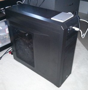
If there’s been one bit of luck in this whole episode it’s that I happened to have the makings of a new PC sitting in boxes in my office when the power surge happened. I’d been planning on upgrading my main PC and had bought the components in preparation of a leisurely build and test cycle before I transitioned to the new machine. Clearly there was a rush on and I needed the PC to act as a primary shared file server and to be running back scripts rather than my main development PC. So one very late Friday night later I had the machine built and Windows 7×64 Pro installed on it.

I don’t really want to talk to much about the specs of the PC because, well, it bores me. But if you want to know it’s an i5-3570 (my first Intel machine) on a ASUS motherboard with 16GB of ram, a Gigabyte 7850 video card, a 256GB SSD boot drive and a WD Green 2TB hard disk. I was primarily interested in keeping the machine quiet so there’s a high end modular PSU in the machine, a Noctua HSF combination with a low speed 150mm fan and it’s all sitting in a huge well ventilated Corsair Carbide 500R case. The machine seems to work well, is very quiet, and operates much cooler than the AMD based machine I’m using right now. I’ve installed VirtualBox on the new PC too and have Ubuntu running in it performing all of the required backup tasks that I had running on my main PC for just a day or two. The new PC is also acting as a central file repository on my network and is keeping synced copies of all critical files on several external USB drives. This setup will have to tide me over until the Mac returns.

Lessons Learned

This whole disaster could have been avoided if I’d just taken care with how I’d had the network switch had been plugged into the power. I suspect it wiped out the Mac Mini and the old ADSL modem via network cables. I’m just lucky it didn’t take out my main PC and laptop as well. We had minimal data loss because my last backup was just a few hours old. All backups here are automatic and the effort I put into the system a while back paid off in spades. Most of my time has been lost building the new PC, getting a grip on Ubuntu and how it works with VirtualBox, and running backwards and forwards to computer shops and repairers. I’ve also realised I needed a real UPS to allow me to gracefully shut down my computers when the power goes off next time.

Why I Liked World War Z

First, a disclaimer. I love zombies. In the last few years zombies have entered the mainstream and I’ve loved every bit of it. So I went into World War Z wanting to love it. I wanted to love it despite the troubled development of the movie, the constant negative press leading up to it’s release, and the warnings that the adherence to the source material (Max Brooks’ book, World War Z) was poor. Did I love it? No. But I did like it quite a bit.

First, the movie itself. It’s split clearly into three acts. The first sets up the the character of Gerry Lane (played by Brad Pitt), his family, and the fall of the world to the so-called zombie plague. This act plays out well with a fast and tense opening and the appearance of the first zombies is quite shocking. For the zombie aficionados the zombies in World War Z are initially portrayed as fast-movers, contrary to the book where they were definitely slow.

The second act, takes us through Lane’s global journey as he tries to seek the source of the out-break of the zombie plague. There’s some spectacular action shots in this act, with hordes of thousands of zombies running amok in the streets of Jerusalem. I can see where the (supposed) $200 million spent making this movie went when I see these scenes. The only comparable “horde” CGI shots that I can recall are some of those seen in The Return of the King.

The final act, which is probably the weakest, resolves Lane’s quest. It’s at this point that the movie reverts to costumed zombies that we’re all more used to seeing in movies such as Night of the Living Dead, 28 Days Later, and the rather hilarious Zombieland. There’s some tense moments and I certainly jumped a few times. The resolution to the movie is a little weak and from what I understand it’s this part of the plot that caused the most troubles during development and it shows. The ending is a little open and I wouldn’t be surprised to see a sequel.

Given that this movie is a hardcore action blockbuster I’d dare to say that there’s very little character development in the movie other than with Pitt’s character. We learn he loves his family, has a somewhat shady past working for the United Nations, and has a surprising ability to survive airline crashes and being impaled on aircraft components. Other characters are something of non-entities with only a couple springing to mind. The first, Pitt’s wife, Karin Lane (played by Mireille Enos) is something of a non-entity who should know that ringing someone’s phone when they are in a zombie infested area is usually a bad idea. The second, is a zombie who appears on screen for nearly 5 minutes towards the end of the movie. Never did I think that bad dentures, rolling eyes, and grey corpse like make-up could convey such humour and menace. Yet, somehow they did, much to the amusement of myself and many others in the cinema.

It’s worth me spending a few lines talking about how the movie adheres to the book by Max Brooks. Basically, it doesn’t. There’s some echoes of it in a couple of spots. The strongest of these is when Lane talks to a US special forces captain in South Korea (played by James Badge Dale) and he starts re-counting the sort of zombie origin tale that was at the core of the original book. However, shame on the producers changing the origin to South Korea instead of the China as stated in the book. I understand this was done to not offend the Chinese film market. So, if you’re a lover of the book don’t expect much homage paid to it by the movie.

I wanted to love this movie since the first day I’d heard about it, and given all the bad press I went in expecting to hate it. I left quite satisfied, having enjoyed the journey. It’s a fun ride from beginning to end, with the required number shocks to make me jump in my seat and enough zombies to satisfy even the most ardent fan. Recommended.

Short Form Copy Landing Page Experiment

As a result of the utter failure of my recent long form copy landing experiment I decided to take some of the lessons I learned and apply them to my short form copy landing pages. There were several key points I tried to keep in mind when constructing the new short form landing page. Here’s what I tried to keep in mind:

  1. Centre and bold the title and sub-title.
  2. Target the title specifically at the Adwords keyword to increase page quality score.
  3. Focus the sub-header clearly on the key benefit of the product.
  4. Use a catchy (and REAL) user testimonial as the first real content.
  5. Include a source for the testimonial, including a real name, a real company and a live link to the company. Adds greatly to the credibility.
  6. Provide a clear call to action AFTER establishing credibility.
  7. Provide clear pricing information.
  8. As I’m selling software give technical requirements to help re-assure and also stop invalid conversions (ie people using non-compatible computer systems).

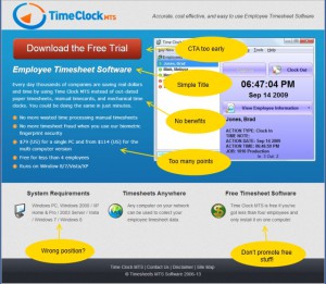
Here’s the old short form page.

Figure 1 : Old Short Form Landing Page

Figure 1 : Old Short Form Landing Page

Not a great landing page but one that has converted fairly well for a while. I believed it could be improved in a number of ways. Firstly, the CTA comes too early. Secondly, the bullet list is too long, the items are too long, and they are not focussed. Thirdly, there’s a very poor benefit focus to the copy. And finally, I believe the system requirements box is better to be used for more important information (such as price).

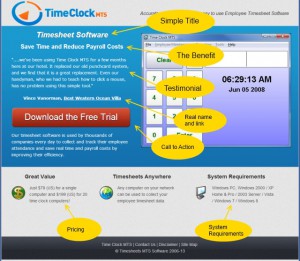
Here’s the new short form page.

Figure 2 : New Short Form Landing Page

Figure 2 : New Short Form Landing Page

You can see that I’ve done my best to incorporate all of the improvements I discussed in the list above. The centered and bolded title and sub-title to draw the eye and the testimonial is good one. I am particularly happy with the sub-title as it encapsulates what I believe are the two biggest benefits users get from using Time Clock MTS. My only concern is that the testimonial is a little long. I’ve got many other testimonials to choose from so I’ll trial some others in the future. The CTA (the download trial button) is in what I think is a good position, credibility has been established and (hopefully) interest piqued. Key objections that a potential user might have are addressed in the smaller text boxes in the page footer. Namely price objections, using the software on multiple computers, and the system requirements.

I setup a Google Experiment to test the new layout versus the old one. Traffic to these pages is 100% sourced from my Adwords campaigns and I chose to split the traffic 50/50 between the two pages (no guts no glory!).

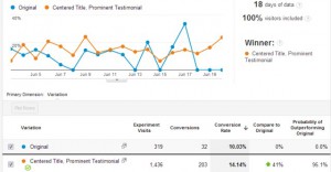
Figure 3 : Experiment Results

Figure 3 : Experiment Results

After Google had collected 18 days worth of data it closed the experiment having found a clear winner. My new short form landing page performed 41% better than the old page. Clearly a big improvement. I’m delighted that the lessons I’ve learned seem to have paid off here. I’m going to validate the experiment by reconfiguring one of my other Adwords landing pages using a similar approach.

My thoughts about further improvement include trying a shorter (and perhaps punchier) testimonial, trialing a different benefit focused sub header, and (perhaps) changing the colour of the CTA button. I’m a little skeptical of the various “I changed the colour my button and doubled conversions” claims that you read but I mustn’t leave any stone unturned.

Long Form vs Short Form Copy Part 3

Well, the results are in. My attempt at long form copy is a failure. You can see the experiment results below:

Long Form Copy Experiment Results

Long Form Copy Experiment Results

As you can see, Google Experiments decided fairly early on that the long form copy page was a load of rubbish and stopped sending visitors to it. The end result was that the original short form copy page out performed the long copy page by 330%. I’d call that a pretty decisive vote against my long copy! Of course there’s a few possible reasons why my long copy page didn’t convert. Here’s what I believe they are in order of likelihood:

  1. My Long Copy is Rubbish – despite spending a lot of time developing my long copy there’s every likelihood that it’s just garbage and would never convert.
  2. Long Copy is Wrong for Potential Time Clock MTS Users – Time Clock MTS is fairly inexpensive and the major barrier to purchasing it (price) is not really there. Long form copy is traditionally suited to expensive or complex purchases. Time Clock MTS is neither of these.
  3. Adwords Visitors Have a Short Attention Span – I’ve noticed that the average time on site for Adwords visitors is much less than for visitors from natural search results. Perhaps they have a shorter attention span or perhaps my Adwords ads are poorly targeted. In any event, long copy is unlikely to work on people with proven short attention spans.
  4. Google Experiments Are Flawed – I’ve completed several dozen Google Experiments now and I’ve seen a clear pattern of behaviour in the case where there’s a clear winner early on (think within a 48 hour period of starting the experiment). After the first day or two Google only directs a trickle of traffic to the page alternative that is clearly the worst option. I’ll need to read a bit more about the reasons behind this.

As a result of this experiment I’ve decided to abandon the long form copy approach for now and tweak my short form copy pages with some techniques I’ve learned from the long copy exercise. More on this shortly.

Long Form vs Short Form Copy Part 2

I’ve spent the last couple of weeks working on a long copy landing page for one of my Adwords campaigns. The page went live this morning and I am A/B testing it against one of my short copy landing pages. It’s important to realize that the traffic to both pages is 100% sourced from Adwords, the traffic will be split 50/50 between the two pages and I’m using Google Analytics to perform the A/B Test.

Here’s a link to a copy of the short copy landing page: Short Copy Landing Page

And here’s a link to a copy of the long copy landing page: Long Copy Landing Page

The A/B test was started at 9.30AM, 22 May 2012.

Long Form vs Short Form Copy Part 1

First, a disclaimer, I am not a marketing professional. I do a lot of reading and I try different things but I don’t pretend to understand the detailed psychological reasons why certain marketing approaches work and others do not. One type of marketing I’ve been interested in for a while is the performance of Long Copy on landing pages versus Short Copy on landing pages. Given my somewhat haphazard approach to marketing copy it’s impossible to define what you find on my landing pages as either short form or long form. Most would be defined as short form, but calling it well-crafted short form copy would be a stretch. The closest I’ve ever come to really trying to generate short form copy would be landing pages specifically created for various Adwords campaigns.

Long form copy has its roots in direct mail outs. It is typically (as the name suggests) a lot of text aimed at breaking down objections or barriers that consumers have when making a purchasing decision about a complex or expensive product. Long form will have multiple call to actions (CTA), repetition of benefits and price information, and will encourage the reader to jump around the text as they address their particular concerns. In short, long form copy tells a story, breaks down barriers, and engages the consumer.

Conversely, short form copy is writing that gets right to the point and is targeted in the language, slang, or vernacular that your target market expects or understands. It will provide the basic information the consumer needs to make a decision and usually only have one CTA. Short form copy is intended to capture attention quickly, to not overwhelm with information, and allow a decision to be made. Here’s a (poorly done) short form landing page that I’m currently using for one of my Adwords campaigns. Conversion is rather dismal, around 12%.

Short Form Landing Page

As you can see, there’s a minimal amount of information and one (rather obvious) CTA. The great big red “Get the Free Trial” button. In the interests of not distracting visitors to this page I’ve removed all site navigation apart from some links in the footer at the bottom. I’ve also ensured that the CTA button appears “above the fold”* for most commonly used browser sizes. The copy on this page is (in my opinion) particularly poor. It’s a mish-mash of benefit / feature/ information based copy. Trying to achieve these three things with so few words really ends up telling the user nothing. The key reasons for trying to make three messages on this page are:

  • It’s been drummed into me that features don’t sell software, benefits sell software. So, list some benefits.
  • It’s short form copy. You can’t help but use few words when describing the benefits. So, yes, Time Clock MTS WILL save you money. It’ll save you a bunch of money. But I don’t have the room to tell you exactly WHY it will save you a bunch of money.
  • You can’t NOT mention features. People need to know what my product is, what it does, and some basic feature information so they have some idea that it might be useful.
  • It’s been drummed into me that you MUST tell the visitor the price of the software and whether or not it will work on their computer. Not telling them this is just going to annoy them and make them look elsewhere.

My aim with this series of blog articles is to craft a long form landing page for one of my Adwords campaigns, A/B test it in Google Analytics, and report on the results here. I haven’t quite decided on the landing page yet but the form is similar to the example I’ve linked to above.

* Above the Fold: above the fold means that the button appears on the web page without the visitor needing to scroll down the page. Any page elements that do not appear on a page without the visitor needing to scroll run the risk of not being seen by the visitor. They simply might not know that there’s more of a web-page to see than what they do when they first arrive.

Adwords – Conversions By Country

I hired a well known Google Adwords consultant to setup some campaigns for me late last year. Geographic targetting was done on the basis of my previous sales database. The consultant finished work for me recently and I’ve been going through the conversion results to check the ROI. In terms of downloads (the only metric I can reliably track from Adwords or Google Analytics) the campaign appears to be reasonably successful. Here’s a graph of the traffic since the start of this year originating from Adwords.

Adwords Traffic

Adwords Traffic

The blue line shows total Adwords traffic, the orange line is traffic originating from Italy (one of the 10 countries I targeted with Adwords). The big jump in March is when I switched off the search network in Adwords and directed by entire budget to the content network. The cost per conversion for the search network was simply not viable. Since mid-March the cost per conversion has been quite reasonable. Today, when I was conducting my first audit of the ROI on the Adwords I found something very different.

Italian Adwords referrals comprise 11.0% of total Adwords traffic since January 1. Conversions (software downloads) from Italy comprised 13.4% of the total. However, when I examined my sales for the period the total sales made to Italy totalled $0. Let me repeat that, $0. It turned out that 3 or 4 of the other countries we’d targeted since day 1 had performed just as poorly. So needless to say these countries are now excluded from the Adwords campaign leaving budget to be spent on countries that I know do convert!

Moral of the Story : regardless of what historical information tells you always check what is going on now. Italy has been the source of quite a few sales for me over the years but clearly Adwords traffic from that country is rubbish for my products.

Caching Your Website Content

I’ve always tried to include some varying content on my websites because many people believe it helps your search engine rankings. The logic being that fresh content is likely to be more relevant and get a boost in the SERPS. I don’t know if it’s true or not because I can’t find anything definitive posted by anyone from Google or a similar major search engine. In any event, it seems like a good idea and I’ve been including a small amount of changing content on my website for years. Thinks like the last 5 blog entries or customer testimonials mainly.

That sort of content is database driven so rather than hit your database every time there’s a pageview you should consider creating the content on a regular basis and having your website display the cached information. I do this with PHP and CRON jobs. My PHP script generates the content and writes it to a file. A bit of PHP in the web template includes that file to display the content. The CRON job runs the PHP that generates the content, perhaps hourly, but more commonly, daily.

Here’s what my CRON jobs generally look like:

14 */8 * * * php /srv/www/public_html/cron-scripts/create-blog-links.php

And a skeleton PHP script to generate some content looks something like what I’ve shown below. Note that I echo out the data created because (generally) when your cron jobs are run you’ll get an email from your server displaying the output from the script.

	$now=microtime(true);

        //code to generate content goes here

	$file_name="/path/to/webroot/generated-includes/blog-links.php";
	
	$content=get_content();
	
	if (strlen($content)>0)
	{
		$file_handle=fopen($file_name,'w') or die('cannot open file');

		fwrite($file_handle,$content);
		fclose($file_handle);
	}
	
	echo "create-blog-links.php complete, run time:".number_format(microtime(true)-$now,4)." seconds<br /><br />";
	echo "$content<br />";
	
	
?>

And finally, the include for my web templates that actually show the generated content. Again I do this in PHP.

include('/usr/www/generated-includes/latest-blog-links.php');

I believe this process could be taken one step further (and it’s something I plan on experimenting with) by actually rotating the parts of the static content of a website. I think I’d do this less frequently, perhaps weekly or monthly and you’d want to make sure you have a large pool of static content to rotate in and out.

Why a (Moving) Picture is Worth a Thousand Words

If you get the same question from your users more than 10 times then you should have written a canned answer for it. If you get questions about your canned answer then you should have made a video for it. There’s no excuse not to. The barriers that used to be put in front of the video creator have largely been removed but I’ll address the three key objections that people put in front of themselves to prevent them from ever making videos.

The Software to create Videos is Expensive

Some is, some isn’t. Some is free. I’ve made extensive use of the completely free and incredibly useful Wink (http://www.debugmode.com/wink/). This program will allow you to capture your activity as you use your software product or webpage and capture your mouse movements. You can then insert popup messages, timed events, user triggered events, and custom slides into your recorded activity. The results can be output into a Flash (http://get.adobe.com/flashplayer/) that pretty much any web browser can display.

I Don’t Have the Voice for a Video

Then don’t do voice with your videos. Communicate what you need to via popup text windows. If you’re building a demonstration video that doesn’t need user interaction you should be careful with the pacing to ensure your viewers can read all your text before your text disappears.

Making Software Demonstration Videos is Hard

I’ve made several dozen and while I wouldn’t call making software demonstration videos hard I would call it laborious and fiddly. Learning your video production software is going to be tricky but the actual production is going to take real time. You’ll be running the video over and over to test timings, adjusting graphics to make them pixel perfect so that you don’t get things jumping around in your video, and you’ll struggle initially to develop the overall concept for each video. But, it goes get easier with time. I usually budget 2-3 hours of real time to produce each minute of my video demonstrations.

Why Videos are Better

People don’t read emails. And my experience is that the more you write in an email, the less they read. If you’re trying to explain something complex a blog article or canned email is better than nothing, but a video is better. Case in point, for years I struggled with software users who couldn’t register their software. I fine-tuned my email response explaining how to do it, I fine-tuned the blog post that was full of screenshots explaining how to do it, and I fine tuned the actual registration process within the software itself. And still I got 3-4 emails a day from users who just didn’t get it. Then I built a software demonstration video of the registration process and linked to new purchasers to that. These days I probably get one email every two weeks about software registration. Videos just explain things better than an email or a blog post could ever hope to.
There’s another big benefit to using software demonstration videos on your website. In this new age of Search Engine Optimization videos lead to more engaged website visitors. Videos capture visitors for longer than blog articles because you can’t skim read a video. More engaged customers are viewed favourably by search engines and videos may have a positive impact on your search engine rankings.

Other Tips

  • Don’t forget to upload your videos to YouTube. Having a YouTube channel with all of your software video resources is a useful social channel that can be developed with very little effort.
  • Brand your videos and if possible embed URL’s to your websites in them. You never know where your content is going to be shared.
  • Don’t forget to include promotional opening and closing slides to your videos. Sell your product, your brand, and your websites.
  • Include links to your other videos and gain more traction with your visitors.

Google Nexus 4

A couple of months back my HTC Wildfire S started complaining about there not being enough memory to download and install Android and other bloatware updates. It was getting to the point where the thing wouldn’t start up properly or wouldn’t close down without me manually clearing out all of the borked updates. I’d uninstalled all the apps from it, moved as many of them as I could to the SD Card but the phone has pretty much obsoleted itself. I started looking around at new phones without much enthusiasm and had pretty quickly settled on an iPhone 4 or a Samsung Galaxy S2. These met my two main criteria, firstly, enough memory to stop the sort of crap the HTC phone had afflicted me with, and secondly not too expensive. I just couldn’t see any earthly reason why I’d spend $500+ on a phone. I mean, come on, it’s just a freaking phone!

I drifted along aimlessly for weeks with my HTC keeping it going because I really didn’t want a new phone. The Samsung and the iPhone didn’t excite me and it’s completely usual for me to procrastinate endlessly over purchases that don’t excite me. Unless a gadget is terminally ill or the replacement is alluring in some way then I’ll just stick with the status quo. Then I read a review of the Google Nexus 4, the phone made by LG for Google to run their Android 4.2 operating system. An OS that wasn’t burdened down by crappy OEM apps that you couldn’t install, wouldn’t ever use, and that just got bigger and bigger over time as they endlessly updated themselves. Bliss! Android as Google intended it. I had to have this Google Nexus 4, surely all my phone woes would be solved by this one, single phone, one phone to rule them all, and in the darkness bind them. Errr *cough*, sorry Lord of the Rings flashbacks there.

So I ordered one through the Google Play store. Total cost was AU$419 delivered for the 16GB Nexus 4. It arrived about 3 weeks later and it’s been a very happy relationship so far. So much so that I really have nothing bad to say about the phone. The screen is a nice size but not so huge that I feel like I’ve got a book in my pocket when I’m carrying it around. The camera is nice and takes goodish pictures that work well on social media sites. The performance is snappy, with no noticeable lag or delays running games or apps. For the first time I find myself just playing with a phone rather than using it as, well, a phone. The Nexus is a fun device to fiddle with, download apps to, and customise to suit your whim of the moment. My only warning is that the phone doesn’t contain an external mini SD slot so if you’re someone who must have thousands of songs to listen to then you might be out of luck. I don’t really listen to music so it’s no biggie to me.

Highly recommended.