Category Archives: Online Marketing

Last updated by at .

Managing Bulk URL Exclusions in Adwords

The Google Adwords online interface is horrid. Just abominable. I am sure they all went to iOS UI design school and said, well Apple’s UI is shit but I am sure we can make our stuff shitter. And so they did. Anyway, I manage a very long list of URL exclusions for one of my Display Network campaigns and there’s (apparently) some limit to the number of URL’s you can exclude directly from the campaign placement report. When you exceed the limit (whatever that is) and you try to exclude a URL (using the Edit->Exclude (campaign) option) you get this (fucking) useless error message:

useless-message

Thanks. A. Lot. You useless pack of dickheads.

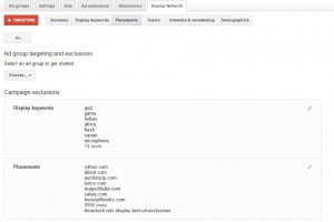
Anyway after trying Google’s live support (useless), and their online forums (which only dream of one day being merely useless) I finally worked out that my list of exclusions had gotten too long. So, now I got to dig around in the online Adwords UI looking for a way of having a longer list. There is a way, but oh my goodness, finding it makes Indiana Jones’s quest for the Lost Ark of the Covenant look like a stroll to the local shop for a carton of milk by comparison. Again. Fuck. You. Google. Anyway, you manage the list from within the Campaign->Display Network tab of the Adwords system. Click on the TARGETING button, then look in the PLACEMENTS box (second from the top) and click the stupid little pencil icon to edit the placement list.

useless-message-2

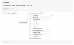
Once you’ve done that you’ll see something like that below. Click the LISTS button

useless-message-3

Once you’ve done that you’ll be given an option to CREATE AND MANAGE LISTS. Once you’ve clicked on that option you can create a new URL exclusion list which can contain a very large number of exclusions. What is the very large number? I have no clue as the Adwords documentation sucks seven different types of ass. But my list is several thousand URL’s long and it seems to still be working OK.

Anyway, after spending several hours working this out you can probably sense my frustration with the Adwords management system. I get similar levels of frustration when I am forced to use iTunes but I have to say that the Adwords UI has taken it to a whole new level. Congratulations you asshats.

Redirecting Adwords by Operating System

My desktop software products run on Windows. I spend a significant amount each month on Google Adwords to drive traffic to my websites, which is problematic as Adwords does not allow you to filter traffic by operating system. It does allow you to reduce bids on Mobile traffic but it bundles Desktop/Full Sized Tablet with Browser traffic into one segment. In the last few years the amount of non Windows OS traffic I receive via Adwords has grown steadily and now makes up slightly more than 50%. I’ve been struggling for a while to work out what to do with this traffic as clearly users from non Windows devices cannot use my software. Yesterday at 4AM I hit on a possible solution and spent the day implementing it. Basically I’m now intercepting the clicks on my “Download Now” buttons/links, checking the client operating system, and if it’s not a version of MS Windows then redirecting them to a page targeted at my online SAAS products. Those products WILL work on their non Windows devices. Sure, it’s an obvious thing to do but I work in isolation and sometimes it takes me a while (years) to reach the “obvious” solution to a problem.

Here’s how I did it:

1) Installed the PGWBrowser plugin for jQuery. This plugin allows you to detect the OS, browser and viewport of web clients.
2) Enabled the plugin in WordPress by enqueuing the JS file:

wp_enqueue_script('pgwbrowser',get_stylesheet_directory_uri().'/js/pgwbrowser.min.js',array(),false,true);

For non WordPress pages (my Adwords landing pages) I used the following (making sure it came after loading jQuery):

<script type="text/javascript" src="/wp-content/themes/Divi-child/js/pgwbrowser.min.js"></script>

3) Now I adjusted the onclick call on my download buttons. I know that using the onclick event like this is archaic but I’ve been doing it this way since 2004 and it works nicely so I’m not changing it! I use this event to redirect users who download the software to a “Download Complete” page that allows me to count downloads. Here’s what the HTML/JS looks like now:

<a class="button_class button_icon_download" href="/downloads/some_file_name.exe" onclick="SetUpRedirect('some_file_name.exe',event)">

You can see I’ve passed the file name to be downloaded to the JavaScript function as well as the event (click) object.

4) The final step was to adjust the SetUpRedirect JS function to accomplish my goals. Here’s what that looks like now:

function SetUpRedirect(destination,event_object)
{
		var pgwBrowser = jQuery.pgwBrowser();
		var os=pgwBrowser["os"];
		var os_name=os["name"];
		os_name=os_name.toLowerCase();

		if (os_name.indexOf("windows")>-1)
		{
			setTimeout(function(){window.location='http://'+location.hostname+'/download-file/?file='+destination;},3000);
			return true;		
		}
		else
		{
			event_object.preventDefault();
			location.href="http://"+location.hostname+"/some-landing-page/?file="+destination+"";
		}
	}

That’s all pretty self explanatory. We’re making use of the PGWBrowser plugin to get the Operating System of clients and checking if it contains “Windows”. If it does those users get redirected to the download success page as usual. However, if they are not Windows users we use the jQuery preventDefault method on the event object to stop those users downloading the trial version of my software. They are then redirected to another landing page that says something like “hey we noticed you’re using a non Windows device, why not try out our spiffy web-based product instead?” Neat.

Uninstall Surveys

There was a post on the almost dead Business of Software forum last week from a poster who had recently implemented an ‘uninstall survey’ in his try-before-you-buy software product. An uninstall survey is triggered when a software product is uninstalled from the host operating system. It usually takes one of two forms, the first is a small program that asks some questions and then emails the results or posts them to a website. The second (and far more common) type of survey is triggered by popping up a webpage on the software product website.

But, I digress, the main point of the post was that the number of responses the poster was receiving was small and the number of useful responses was even smaller. I’ve included an uninstall survey with my product Time Clock MTS for several years and this mirrors my experience. I’m lucky to see a 10% response rate (10% of total downloads) and of those, not more than 1 in 10 or 20 actually contains useful information. At first glance it seems to be hardly worth the effort but the hour or two it took to implement has probably seen an ROI measured in thousands of percent. It has allowed me to save the occasional sale by responding to a user who complained of missing features in my product that were not missing at all. It has allowed me to find holes in my documentation and fill them, it has highlighted certain software features I was missing and that respondents found useful, and it has helped me fix up problems with the process flow in the software.

My experience certainly pours water on the comments of one poster on the BoS forums who suggested:

Indirectly related, the existence of an uninstaller often implies a poor architecture, such as apps that stuff random files and overwrite libraries in many places.

This is an insanely negative attitude. Knowing that a product is not perfect and can be improved is the ONLY way of being able to build a better product. And the best way to build a better product is to establish channels of communication with your customers. The software uninstall survey is one channel that is virtually free to establish and provides a means of communication that, in the case of downloadable trial software, would otherwise be impossible. Consider that a trial version of my software can be downloaded, installed, and trialed all without the user having to email me, ask me for a registration key, or even make me aware that they are using the software. Giving the user the opportunity to communicate with me once they have decided to uninstall (and presumably not purchase) my software has proven to be invaluable.

If you’re wanting to implement an uninstall survey, you sell Windows software and you’re using the very nifty (and free) Inno Setup then it’s dead simple. Just add an URL to the [INI] section of your Inno Setup script like this:

[INI]
Filename: {app}UninstallSurvey.url; Section: InternetShortcut; Key: URL; String: http://www.some-domain.com/uninstall-survey.htm

And then add an [UninstallRun] section to your script that opens the URL.

[UninstallRun]
Filename: {app}UninstallSurvey.url; Verb: open; Flags: shellexec

In my case I open an URL to present the user with questions. But there’s no reason why the [UninstallRun] section couldn’t run a small executable file that pops a window up to the user asking them the same questions. Those results could either then be emailed or POST’ed to your website. For your reference here’s the Time Clock MTS Uninstall Survey. It used to have a lot more questions but I’ve simplified it greatly based on the response of one poster in the BoS thread I referenced in the first paragraph. Respondents simply fill in the details and I receive an email contain the responses and a couple of other bits of information such as the users IP address and user-agent. The user-agent is particularly useful so that I know what version of Windows the respondent is using.

There you have it, uninstall surveys. Quick and easy to implement, zero on-going costs, and they provide you with a communication channel to software users that is unlikely to exist otherwise. If you’re selling try-before-you-buy software you’d be crazy to not be using them.

Dipping my Toes in the ODesk Pond

I’ve known for a while that the main limiting resource in the on-going growth of my software business is me. I’ve had real issues being willing to farm out work to others and it hasn’t helped that when I have reached out and found others to do work for me that results have mostly been awful. There’s been one good experience on 99Designs a few years back and about six months ago I found a Virtual Assistant in Canberra who has been doing good work for me. But other than those two I’d say quite cheerfully that I’ve wasted my money paying people to do work for me.

My problem right now is that I want to build some Explainer Videos for one of my products and need some inspiration in terms of the tone, and content of the scripts for those videos. The videos will be used on Ad Words landing pages. I want them to be short (two minutes or so) and to quickly establish empathy with the potential users (we understand your problem) and then present them with a solution (my software). I’d like the videos to be light-hearted and, if possible, amusing. After all, my products are pretty boring so any humour that can be injected can only be a good thing. I’ve written one script myself but really want a few so I can get 10-15 minutes of voice talent recorded with the eventual aim of getting several videos made and A/B testing them. Now, I know that I should write the scripts myself but to be perfectly honest I don’t have the time or the talent to write multiple scripts from a blank page. So I was hoping that I could find some people with some experience creating explainer video scripts and they could write some scripts for me. Even if I don’t use the scripts at least they’d provide me with some inspiration so I could develop a few more myself.

ODesk seems to be the freelancer site of choice these days. So I’ve toddled off and set up an ad for 2 x 2 minute explainer video scripts. After a week or so I’d got 6 applications and a few hours ago I chose two of the applicants to interview via Skype. I’ve since conducted those interviews and hired both applicants. My expectations are not high but for the cost a few hundred dollars I might get one script I can use and I’m fairly certain I’ll get some useful ideas I can work on myself.

Trouble with Google Experiments

I’ve been using Google Experiments (GE) pretty heavily in the last year and the method it uses to send traffic to landing page alternatives has always confused me a little. So yesterday I did some searching and it turns out that GE uses a “multi-armed bandit” method a splitting up traffic between alternatives. Basically this means that each experiment starts with a short evaluation period when traffic really is split up 50/50 (or whatever percentage you choose). After the evaluation period that the conversion rates of both alternatives are measured and more traffic is sent to the higher converting page. This evaluation is carried out a few times a day and the traffic split is adjusted accordingly. The reasoning behind this is supposedly two fold:

1. It minimizes the effect on overall conversion for the period of the experiment if one of your alternatives is particularly horrible.

2. It can lead to a much faster 0.95 confidence result especially when one alternative performs much better than the other.

Figure 1 : Conversion Variation

Figure 1 : Conversion Variation

With low traffic pages (say 100 visitors or less per day) if one of the alternatives happens to have a really good first day or two then you can end up with 90% of the traffic going to that and 10% going to the other. And these really good and bad days DO happen, it’s the nature of random variation and small sample sizes. I often see pages that have average long term conversion rates of 15% having 2% or even 0% conversion days. In the figure above you can the light blue line shows the conversion rate of one of my landing pages over a 30 day period. The rate varies quite randomly between less than 5% to more than 25%.

So imagine the situation where the initially poorly performing alternative is getting just 10 or so visits per day and normally has conversion rates of <10%. It can easily be DAYS before it has another conversion. And each day Google is evaluating that performance and sending the the page LESS traffic. Often this is just 1-2 visitors a day. So failure is basically assured. [caption id="attachment_243" align="aligncenter" width="300"]Figure 2 : Traffic Distribution During Experiment Figure 2 : Traffic Distribution During Experiment[/caption]

The net result of this is that the last week or so of an experiment often virtually ALL of the traffic is being sent to one alternative if it happens to perform better in the first few days of an experiment. And I’ve now seen this a number of times. I haven’t done the math on it but looking at my results I’ve had experiments conclude with a winning result getting 10-20x the traffic of the failing result. You can see and example of this above. The winning alternative (the orange lines) showed a great conversion rate in the first few days which resulted in less and less traffic being sent the alternative (the pale blue line). In fact, for the last 10 days of the experiment the poorer performing alternative received almost no traffic. At the end of the experiment the winning result got 1244 visits for 281 conversions and the alternative got just 212 visits with 18 conversions. To my mind 212 visits just isn’t enough to be statistically significant and certainly not enough to declare a conclusive winner.

It turns out that there’s a an advanced setting buried in the Google Experiments advanced settings called “Distribute traffic evenly across all variations”. This is OFF by default and needs to be turned on to ensure that the experiment actually uses the 50/50 traffic split (or whatever % you choose). My feeling is that it’s hazardous accept the result of just one GE that uses the multi-armed bandit method. Especially for low traffic landing pages. Multiple experiments are required. Of course this should be true of any A/B test. I also think that if you’re evaluating low traffic pages then you should conduct your experiments using the true 50/50 traffic split and compare those with the multi armed bandit method.

As an addendum here’s someone who takes a contrary view to the rosy view presented by Google in the page I linked to above. The folks on Visual Website Optimizer do not think multi-armed bandit is better than regular A/B testing.

Short Form Copy Landing Page Experiment

As a result of the utter failure of my recent long form copy landing experiment I decided to take some of the lessons I learned and apply them to my short form copy landing pages. There were several key points I tried to keep in mind when constructing the new short form landing page. Here’s what I tried to keep in mind:

  1. Centre and bold the title and sub-title.
  2. Target the title specifically at the Adwords keyword to increase page quality score.
  3. Focus the sub-header clearly on the key benefit of the product.
  4. Use a catchy (and REAL) user testimonial as the first real content.
  5. Include a source for the testimonial, including a real name, a real company and a live link to the company. Adds greatly to the credibility.
  6. Provide a clear call to action AFTER establishing credibility.
  7. Provide clear pricing information.
  8. As I’m selling software give technical requirements to help re-assure and also stop invalid conversions (ie people using non-compatible computer systems).

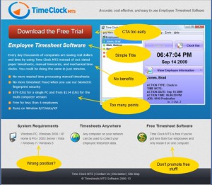
Here’s the old short form page.

Figure 1 : Old Short Form Landing Page

Figure 1 : Old Short Form Landing Page

Not a great landing page but one that has converted fairly well for a while. I believed it could be improved in a number of ways. Firstly, the CTA comes too early. Secondly, the bullet list is too long, the items are too long, and they are not focussed. Thirdly, there’s a very poor benefit focus to the copy. And finally, I believe the system requirements box is better to be used for more important information (such as price).

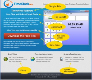
Here’s the new short form page.

Figure 2 : New Short Form Landing Page

Figure 2 : New Short Form Landing Page

You can see that I’ve done my best to incorporate all of the improvements I discussed in the list above. The centered and bolded title and sub-title to draw the eye and the testimonial is good one. I am particularly happy with the sub-title as it encapsulates what I believe are the two biggest benefits users get from using Time Clock MTS. My only concern is that the testimonial is a little long. I’ve got many other testimonials to choose from so I’ll trial some others in the future. The CTA (the download trial button) is in what I think is a good position, credibility has been established and (hopefully) interest piqued. Key objections that a potential user might have are addressed in the smaller text boxes in the page footer. Namely price objections, using the software on multiple computers, and the system requirements.

I setup a Google Experiment to test the new layout versus the old one. Traffic to these pages is 100% sourced from my Adwords campaigns and I chose to split the traffic 50/50 between the two pages (no guts no glory!).

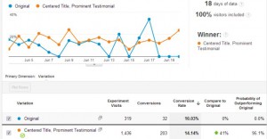
Figure 3 : Experiment Results

Figure 3 : Experiment Results

After Google had collected 18 days worth of data it closed the experiment having found a clear winner. My new short form landing page performed 41% better than the old page. Clearly a big improvement. I’m delighted that the lessons I’ve learned seem to have paid off here. I’m going to validate the experiment by reconfiguring one of my other Adwords landing pages using a similar approach.

My thoughts about further improvement include trying a shorter (and perhaps punchier) testimonial, trialing a different benefit focused sub header, and (perhaps) changing the colour of the CTA button. I’m a little skeptical of the various “I changed the colour my button and doubled conversions” claims that you read but I mustn’t leave any stone unturned.

Long Form vs Short Form Copy Part 3

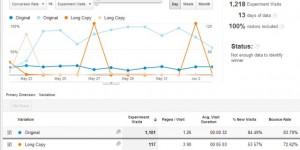
Well, the results are in. My attempt at long form copy is a failure. You can see the experiment results below:

Long Form Copy Experiment Results

Long Form Copy Experiment Results

As you can see, Google Experiments decided fairly early on that the long form copy page was a load of rubbish and stopped sending visitors to it. The end result was that the original short form copy page out performed the long copy page by 330%. I’d call that a pretty decisive vote against my long copy! Of course there’s a few possible reasons why my long copy page didn’t convert. Here’s what I believe they are in order of likelihood:

  1. My Long Copy is Rubbish – despite spending a lot of time developing my long copy there’s every likelihood that it’s just garbage and would never convert.
  2. Long Copy is Wrong for Potential Time Clock MTS Users – Time Clock MTS is fairly inexpensive and the major barrier to purchasing it (price) is not really there. Long form copy is traditionally suited to expensive or complex purchases. Time Clock MTS is neither of these.
  3. Adwords Visitors Have a Short Attention Span – I’ve noticed that the average time on site for Adwords visitors is much less than for visitors from natural search results. Perhaps they have a shorter attention span or perhaps my Adwords ads are poorly targeted. In any event, long copy is unlikely to work on people with proven short attention spans.
  4. Google Experiments Are Flawed – I’ve completed several dozen Google Experiments now and I’ve seen a clear pattern of behaviour in the case where there’s a clear winner early on (think within a 48 hour period of starting the experiment). After the first day or two Google only directs a trickle of traffic to the page alternative that is clearly the worst option. I’ll need to read a bit more about the reasons behind this.

As a result of this experiment I’ve decided to abandon the long form copy approach for now and tweak my short form copy pages with some techniques I’ve learned from the long copy exercise. More on this shortly.

Long Form vs Short Form Copy Part 2

I’ve spent the last couple of weeks working on a long copy landing page for one of my Adwords campaigns. The page went live this morning and I am A/B testing it against one of my short copy landing pages. It’s important to realize that the traffic to both pages is 100% sourced from Adwords, the traffic will be split 50/50 between the two pages and I’m using Google Analytics to perform the A/B Test.

Here’s a link to a copy of the short copy landing page: Short Copy Landing Page

And here’s a link to a copy of the long copy landing page: Long Copy Landing Page

The A/B test was started at 9.30AM, 22 May 2012.

Long Form vs Short Form Copy Part 1

First, a disclaimer, I am not a marketing professional. I do a lot of reading and I try different things but I don’t pretend to understand the detailed psychological reasons why certain marketing approaches work and others do not. One type of marketing I’ve been interested in for a while is the performance of Long Copy on landing pages versus Short Copy on landing pages. Given my somewhat haphazard approach to marketing copy it’s impossible to define what you find on my landing pages as either short form or long form. Most would be defined as short form, but calling it well-crafted short form copy would be a stretch. The closest I’ve ever come to really trying to generate short form copy would be landing pages specifically created for various Adwords campaigns.

Long form copy has its roots in direct mail outs. It is typically (as the name suggests) a lot of text aimed at breaking down objections or barriers that consumers have when making a purchasing decision about a complex or expensive product. Long form will have multiple call to actions (CTA), repetition of benefits and price information, and will encourage the reader to jump around the text as they address their particular concerns. In short, long form copy tells a story, breaks down barriers, and engages the consumer.

Conversely, short form copy is writing that gets right to the point and is targeted in the language, slang, or vernacular that your target market expects or understands. It will provide the basic information the consumer needs to make a decision and usually only have one CTA. Short form copy is intended to capture attention quickly, to not overwhelm with information, and allow a decision to be made. Here’s a (poorly done) short form landing page that I’m currently using for one of my Adwords campaigns. Conversion is rather dismal, around 12%.

Short Form Landing Page

As you can see, there’s a minimal amount of information and one (rather obvious) CTA. The great big red “Get the Free Trial” button. In the interests of not distracting visitors to this page I’ve removed all site navigation apart from some links in the footer at the bottom. I’ve also ensured that the CTA button appears “above the fold”* for most commonly used browser sizes. The copy on this page is (in my opinion) particularly poor. It’s a mish-mash of benefit / feature/ information based copy. Trying to achieve these three things with so few words really ends up telling the user nothing. The key reasons for trying to make three messages on this page are:

  • It’s been drummed into me that features don’t sell software, benefits sell software. So, list some benefits.
  • It’s short form copy. You can’t help but use few words when describing the benefits. So, yes, Time Clock MTS WILL save you money. It’ll save you a bunch of money. But I don’t have the room to tell you exactly WHY it will save you a bunch of money.
  • You can’t NOT mention features. People need to know what my product is, what it does, and some basic feature information so they have some idea that it might be useful.
  • It’s been drummed into me that you MUST tell the visitor the price of the software and whether or not it will work on their computer. Not telling them this is just going to annoy them and make them look elsewhere.

My aim with this series of blog articles is to craft a long form landing page for one of my Adwords campaigns, A/B test it in Google Analytics, and report on the results here. I haven’t quite decided on the landing page yet but the form is similar to the example I’ve linked to above.

* Above the Fold: above the fold means that the button appears on the web page without the visitor needing to scroll down the page. Any page elements that do not appear on a page without the visitor needing to scroll run the risk of not being seen by the visitor. They simply might not know that there’s more of a web-page to see than what they do when they first arrive.

Adwords – Conversions By Country

I hired a well known Google Adwords consultant to setup some campaigns for me late last year. Geographic targetting was done on the basis of my previous sales database. The consultant finished work for me recently and I’ve been going through the conversion results to check the ROI. In terms of downloads (the only metric I can reliably track from Adwords or Google Analytics) the campaign appears to be reasonably successful. Here’s a graph of the traffic since the start of this year originating from Adwords.

Adwords Traffic

Adwords Traffic

The blue line shows total Adwords traffic, the orange line is traffic originating from Italy (one of the 10 countries I targeted with Adwords). The big jump in March is when I switched off the search network in Adwords and directed by entire budget to the content network. The cost per conversion for the search network was simply not viable. Since mid-March the cost per conversion has been quite reasonable. Today, when I was conducting my first audit of the ROI on the Adwords I found something very different.

Italian Adwords referrals comprise 11.0% of total Adwords traffic since January 1. Conversions (software downloads) from Italy comprised 13.4% of the total. However, when I examined my sales for the period the total sales made to Italy totalled $0. Let me repeat that, $0. It turned out that 3 or 4 of the other countries we’d targeted since day 1 had performed just as poorly. So needless to say these countries are now excluded from the Adwords campaign leaving budget to be spent on countries that I know do convert!

Moral of the Story : regardless of what historical information tells you always check what is going on now. Italy has been the source of quite a few sales for me over the years but clearly Adwords traffic from that country is rubbish for my products.